Original photo #1
Original Photo #2
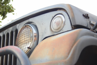
Original Photo #3

Lightroom Processed #1 - I adjusted the exposure to be a little truer to how the light had really looked in the room at the time I took the photo.

Lightroom Processed #2- Again adjusted exposure slightly- played with adjusting the blacks and shadows to see if I could get more contrast but I didn't really notice too much of a difference since there isn't a ton of shadow gradation.
Lightroom Processed #3- The lighting in the room was from a soft overhead lamp- the only light source in the room. I lightened the exposure slightly so that it better reflected the softness of the real lighting. I also emphasized the highlights a little more to bring focus to the glassy knob surfaces.
Ugly Lightroom Processed #1
Ugly Lightroom Processed #2
Ugly Lightroom Processed #3
Its funny how as I was processing the photos for the first time in Lightroom I didn't really see the difference as I was adjusting the sliders to alter the exposure, blacks, highlights etc. It wasn't until I actually typed the values in for each number- gradually going up the scale and then going down- that I began to see the subtle differences in how the adjustments enhanced the photos. There was a point as I was editing the Jeepster photo that I said to myself- "oh yes! Thats the "sweet spot" for the exposure!" It made me happy to realize it- even though it was a relatively small change from the last number. I learned that you can definitely screw up a photo really quick if you don't go back through the "work flow" process and double check the adjustments you've made from the 1st round of editing. While I was playing with making the photos "ugly" I really noticed that. The temp and tint sliders can really mess up the photos when you play with them too much too- hence the odd color tones in the "ugly" processed photos.